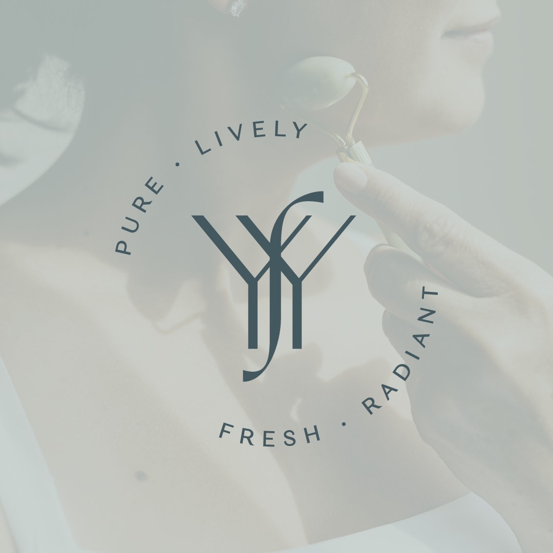
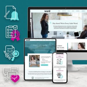
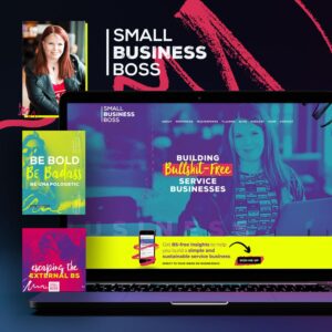
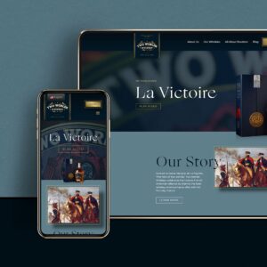
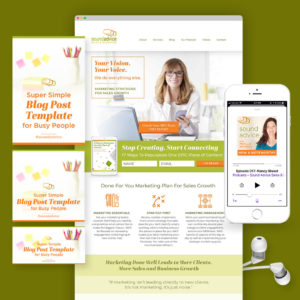
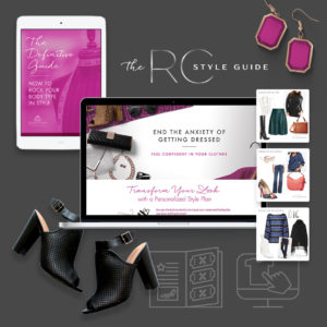
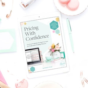
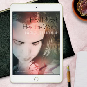
Skip to content
PC-Logo-Gold-no-stroke
  • About
  • Services
  • Portfolio
  • Blog
  • Contact

Branding & Website Design

Stripcraft Branding and Website Design & Development

Page & Podium Branding and Website Design & Development

Horizon Peak Consulting Branding

Yen for Youth Branding

Yoga for You Branding

Every Little Word Website Design & Development

Small Business Boss Brand Refresh + Site Design

Two Worlds Whiskey Website Design & Development

Scoop Studios Branding + Site Design

Avenues Unlimited Branding + Site Design & Development

Janet & Ray Branding + Site Design

List With Libby Branding

Learn more

eBooks, Course Materials, and Special Projects

RC Style Guide Digital Product Design

Pricing With Confidence eBook

Healing eBook Design

Learn more
More pets, more flowers, over on Instagram

Can a font be sexy?? Yes, yes it can. And we had s Can a font be sexy?? Yes, yes it can. And we had so much fun playing with the super sexy Grand Slang font by @nikolastype on our recent project for Stripcraft by LuxATL. This font has a bold, witchy presence that instantly sets the tone. It’s dramatic, a little seductive, and totally unapologetic.

What really makes it shine is the way the regular and italic versions play off each other. Mixing them together gives the typography a playful rhythm, like the text is dancing its way down the page. It's expressive without being hard to read, which made it perfect for Stripcraft’s voice: confident, magnetic, and full of intention.

It’s always a thrill to find a typeface that not only looks amazing but feels like it belongs to the brand. We’re always chasing that perfect brand-font match and this one couldn't be more perfect. Grand Slang grabs your attention while keeping the message clear (and sexy).

I'm not saying fonts are magic, but… this one kind of is. 🖤
We love helping our clients evolve their business We love helping our clients evolve their business as they grow ✨ Swipe to see the incredible transformation of personal stylist Roxanne Carne's (@roxannecarne_stylist) website. We've had the privilege of evolving her brand alongside her business since 2016 as she was ready for each next level, from working with her branding to fully revamping her branding and reskinning her website in 2019, to a complete website redesign last year.

Roxanne’s new site captures everything she embodies: sophisticated, feminine, and effortlessly elegant. Clean typography, muted neutrals with touches of dusky rose, and a seamless user experience that makes potential clients feel confident about partnering with her.

There's something magical about watching a client's vision come to life over the years. Roxanne transforms women's lives through their wardrobes, and we've loved helping transform her digital presence to match that same level of sophistication.

Can't wait to share the full case study when our new website launches! 🤍
#branddesign #websitedesign #personalbranding #clientlove #webdesign #brandstrategy #designstudio #beforeandafterwebsite
Think a logo is all you need? 🤔 Think again. I Think a logo is all you need? 🤔 Think again. I can’t tell you how many times I’ve heard, “I just need a logo,” from potential clients.

Yes, your logo is important, but your brand’s visual identity goes beyond just that one graphic—it’s about creating a cohesive, recognizable presence across every touchpoint. 🎨✨

Swipe through to see why your business’s full visual brand matters and how it impacts trust, credibility, memorability, AND your bottom line. 

Then, go check out the full post for a deeper dive. 

**And I want you to know, even if you’re not ready to pay a designer for a full visual brand, you can start taking steps to be more consistent with your brand even on your own. There are some tips in the post.**
The icon in the Page & Podium logo is more than ju The icon in the Page & Podium logo is more than just a pretty, uplifting mark—it’s a story in visual form. When designing the logo for Page & Podium, we wanted to create something that felt strong, structured, and connected to the brand’s mission of helping mission-driven professionals establish their personal platform.

📖 The Open Book Symbol – At the heart of the design is an open book, representing the power of written content and thought leadership. Page & Podium empowers experts to share their knowledge, and this shape reflects the foundation of their work in the written word—turning expertise into impact.

🎤 A Platform for Stories – The microphone reference symbolizes authority and expertise. Just like a speaker stands on a stage to be heard, Page & Podium helps professionals amplify their voices and position themselves as leaders in their fields.

The book fan icon extends beyond the logo as well and can be used as a branded accent to add balance and flair to content (check it out on the website) and combined with Page & Podium’s taglines to create an impactful messaging element (see the super cute tote).

When you have a unique, meaningful, and versatile mark like this, owning your brand is FUN and empowering.
🔥 Good times. Bad girls. 🔥 I know I’ve te 🔥 Good times. Bad girls. 🔥

I know I’ve teased a little bit of our work with Stripcraft and @lux_atl , and now I’m finally ready to share it starting with the super fun branding we did with gobs of different logo configurations and branding marks. It was seriously so fun to work on. 

Stripcraft isn’t just a brand—it’s a movement. A place where everyday women trade business suits for rhinestones, and step into a world that’s equal parts playful, powerful, and provocative.

When Stripcraft came to us, they already had the spirit—but they needed the polish. Their brand wasn’t quite refined enough to match the high-end retreats and experiences they were offering. So we got to work. 💃

The new Stripcraft brand feels like a secret bad girls’ club, with a visual identity that’s as daring as the women who embrace it. We designed a sleek, electrifying brand experience that turns up the heat without losing the edge:

✨ A logo suite that screams forbidden allure—gothic blackletter meets neon-inspired script, complete with a dancer’s silhouette and iconic ray motifs.
 ✨ A rich, moody color palette—deep purples, fuchsias, and teals glowing against a near-black background.
 ✨ Typography that teases—witchy, scripted headlines with sultry ligatures and bold contrast.
 ✨ Photography direction that seduces—lingerie-clad close-ups, club-inspired lighting, and a visual story that invites women to step into their fantasy.
 ✨ A website that performs—not just functional, but sensational, with bold animations, custom icons, and a layout that keeps visitors hooked.

And because Stripcraft is more than just one experience, we crafted sub-brands for every side of their empire—from high-end retreats like StripCabana to the School of Stripcraft’s year-long dance journey.

This isn’t just branding. It’s a visual revolution for women who are ready to own their sexy, confident selves. And we are so here for it. 😈

💜 Step into the world of Stripcraft the link is in our bio!

More to come on the website and other elements!
This super friendly and fun font family is Neulis This super friendly and fun font family is Neulis Neue by Adam Ladd @adam.ladd.design. We selected Neulis Neue for the bmpconsulting website as its fun feeling perfectly captures Bethany’s vibrant personality and her ice-cream-themed brand and website. 🍧 🍦 🍨 

Now let’s get into some font geek talk:
✵ The Neulis font family is a cheeky mash-up of a strict geometric sans serif and jovial upright script font. I love an upright script with the friendly tails on the letters. 
✵ The monoline or uniform font stroke feels warm and balanced. 
✵ The large x-height (that’s how tall the lowercase letters like x and e are) makes this font super legible and approachable feeling. 
✵ And with a huge range of font weights, this font is super dynamic and versatile in use.

These are all qualities you’d want in your grant-writing professional, right? Balanced, friendly, warm, approachable, and fun—just like Bethany! Grant writing might be tough, but Bethany is a ray of sunshine to her clients and colleagues. That’s why this font is the perfect match for bmp + Bethany.

Swipe to see Neulis Neue in use in the bmp consulting website and collateral. 

Feel like your brand needs a font palette that speaks directly to your values? 👋Reach out and let’s explore how a tailored font selection can amplify and clarify your brand’s voice.

Perennial-Creative-Monogram
Brand Design & Cultivation

Branding & Websites

In-House Design

Special Projects

About

Portfolio

Blog

Contact

Resources

Home

Join our email list and we’ll send new projects and articles straight to your inbox.

Thank you for subscribing!

© 2013-2025 Perennial Creative Co., LLC | All Rights Reserved.
Privacy Policy | Terms & Conditions

social buttons pinterest
social buttons instagram
social buttons facebook
social buttons contact

Designing from Louisville, KY and serving clients world-wide.
Branding, Design & Development by Perennial Creative Co.

social buttons pinterest
social buttons instagram
social buttons facebook
social buttons contact

Designing from Louisville, KY and serving clients world-wide.
Brand + Website Design & Development by Perennial Creative Co.

© 2013-2025 Perennial Creative Co., LLC | All Rights Reserved.
Privacy Policy | Terms & Conditions