Small Business Boss
Brand Refresh & Website Design

Background
Maggie Patterson, the sharp and successful owner behind the service business consulting company Small Business Boss, knew exactly what her brand was: bold, professional, and a little bit badass. All that was missing was the branding to back it up.
Small Business Boss prides itself on being experience-backed, BS- and woo-free, and miles apart from the “courses” offered by lifestyle bloggers looking to make a quick buck. We’re talking actionable, down-to-earth, old-school coaching from a proprietor who walks the walk, talks the talk, and has done so for years.
A story this clear-cut demanded the kind of branding that could enter the room and speak with an equal measure of confidence. You know that feeling you get when you look at an image and instantly know what brand it belongs to? That’s the level of cohesion Small Business Boss needed in order to visually match the strength of the expertise and skill it brought to the table. So we put together a brand refresh that would deliver those eureka! moments at every turn and speak in no uncertain terms about exactly who and what this brand was.

Moodboard
The moodboard we created to reinvigorate this brand centers around fun, honest, cool, edgy, and modern imagery—ideas that perfectly capture the spirit of Small Business Boss. The color palette sets the scene, where bold yet tasteful combinations of contrasting hues build a sense of dynamism and action. Fearless punches of black add a rocker-chic edge. Striking block typefaces convey authority, while touches of graffiti-like script and handmade marks lend an earnest and approachable edginess.
The vital, of-the-moment sense the moodboard cultivated is a thread we continue to weave throughout all aspects of the project. Like a creative, leader-of-the-pack big sister, the moodboard conveys the kind of authority and sophistication that would make you want to borrow its clothes (but not be afraid to ask).
Logo
Our client wanted to keep their existing logo, as its plain-spoken, confident simplicity was already speaking the brand’s language. So we took what was already there and created new variations and configurations to increase its functionality across every use imaginable. Reconfiguring the logo’s block typeface into a tidy square, extrapolating it into a linear hashtag logo, and simplifying it for a monogram and favicon lended the kind of flexibility that a brand that puts out a lot of content demands. Keeping the logo color palette extremely simple—black or white only—gave us a smart way to make the logo agile without losing any of the brand’s clarity.


Graphic Elements
SBB is a growing, dynamic brand that puts out content across so many platforms—social media, courses, mentoring programs, podcasts, and more. So, as to really let the brand sing across any media that could be dreamed up, we developed a slate of brand-affirming yet understated visual styling elements to pepper throughout branded imagery. That signature Small Business Boss edge that our client wanted to cultivate shines through in these clever pops of branding.
Handmade scribbles and marks add visual emphasis and nurture the kind of approachability that comes across in a handwritten note. A selection of textures and visual elements like arrows, tick marks, and text blocks provide the means to give any image the right level of visual interest and on-brand feel. These elements are a powerful vehicle for delivering the kind of instant brand recognition we wanted to impart on every piece of content the brand produced.
Color Palette
To communicate the brand’s keen, sharp personality, we built a palette of stylish turquoise, vivid purple, bright yellow, and cherry red, punctuated with generous helpings of black to add a rock & roll note.
It’s not just these vibrant hues on their own doing the heavy lifting of brand messaging, though; how we apply them is just as important. We tested out combinations of brand colors and came up with distinctive duotone treatments to use liberally throughout the brand. Like the tasteful contrast we touched on with the moodboard, these duotones evoke a refreshing sense of approachability. With this, any image could be put through a duotone process and instantly translated into the brand’s language, be it stock imagery or branding headshots.


Typography
Continuing the journey that the moodboard started, we cultivated a set of fonts that would help Small Business Boss’s written material pack an extra branded punch. We held on to the straightforward and robust sans-serif display typeface from their original branding because it, in a perfect encapsulation of the brand, is self-assured and reliable without being domineering. For body copy we selected a clean, easy to read font that is visually flexible enough across its cases and weights to convey a lucid message wherever needed. For areas where text calls for being underscored or accented, we selected a spirited hand-lettered script that’s energetic but personable, keeping with the grounded and practical mindset of the brand.
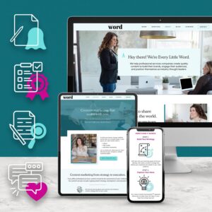
Website Design
Small Business Boss’s narrative was already striking. We built the website to complement it, giving the brand’s strong copy a cohesive visual treatment so that its full story could come across loud and clear. This is a can-do brand, and the website is designed to feel actionable and affable to match.
A striking duotone image of the human being behind the brand greets you head-on alongside header text that, much in line with the brand ethos, isn’t afraid to cuss. Bold blocks of brand colors call back to the industrious energy captured in the moodboard. Subtle animations and circled buttons convey enthusiasm and emphasis.
Graphic elements we’d developed in the brand refresh like textures, scribbles, and other handmade markings lend a human-to-human trustworthiness. The user is left feeling like they’ve found their people, that what they’ve dreamed of for their business is actually possible, and that they’re finally on the right path.

In-House Design
This brand means business, and all of the elements of the brand refresh that we developed were instantly ready to be put to work—and work they do! On an ongoing basis, we design a plethora of branded imagery for Small Business Boss: podcast covers, product images, video overlays, stickers, course materials, email headers, shop graphics, promotions, and much more, each a steadfast messenger of the brand. More to come on our in-house design partnership soon!


Perennial Creative Co. understands how small businesses and entrepreneurs need brands that are compelling. Jessica pushed us creatively, and her vision was spot on. Our brand is 100% us and stands out in a sea of boring branding.