Janet & Ray
Branding + Site Design

Background
Janet & Ray specialize in helping residents buy and sell their homes in and around Eastern Ontario. They offer an unparalleled experience for every client, no matter how big or small the transaction may be.
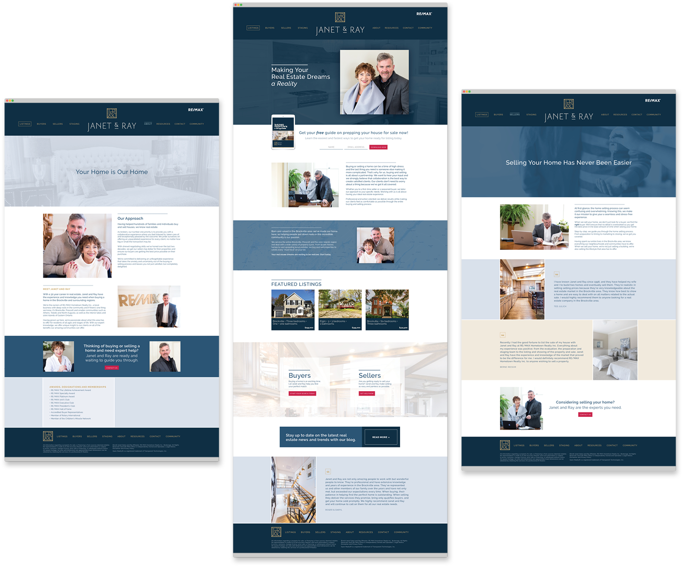
We worked together on their branding and website design to establish a new look that would convey they are approachable, confident, and accustomed to working with high end clients and properties. Their previous website did not convey that same sense of professionalism and confidence they wanted to portray to their top-dollar clients.
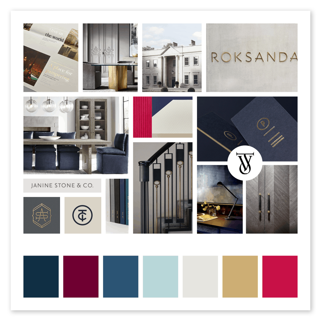
We started the branding process with a phone call to discuss their current client base and their desired clients and how we could create a visual language for their brand that spoke directly to those people. The first step was to create a mood board and from there, the logo designs took shape.
Moodboard
For this updated branding, we focused on high end clientele, so the moodboard strikes a balance of classic and refined design with a nod to a designer’s sensibility through unique lettering and interior details.
The color palette is classic and fresh with neutral gray and navy, elegant gold, and red for a pop of color for interest and calls to action.
Logo Design
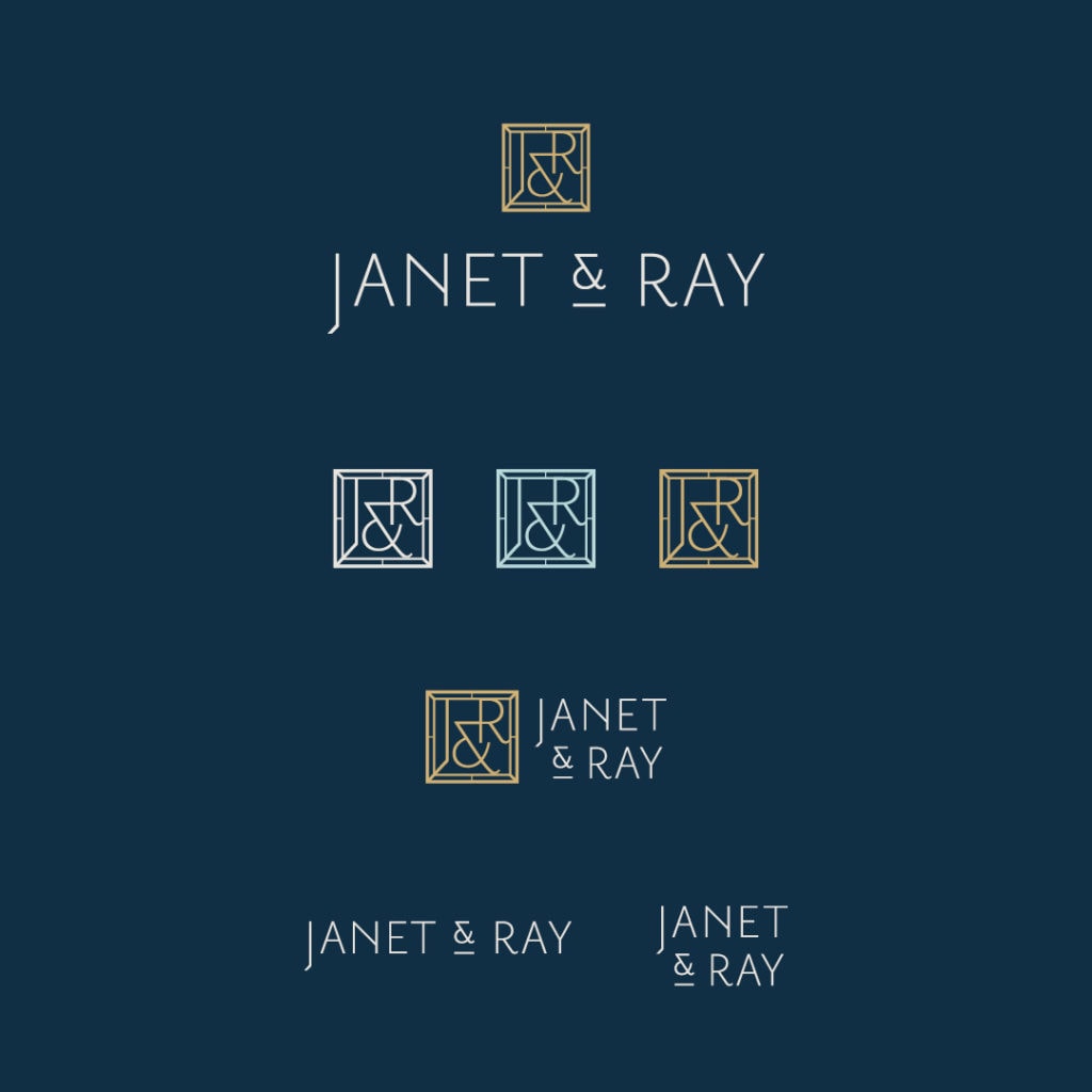
Janet & Ray’s clients are looking for an experienced realtor team that can confidently represent them when selling or buying a home. Their clients rely on them to take the lead to get sellers top dollar for their properties and ensure buyers are getting the best price possible on their purchase.
For Janet & Ray’s clients, a high-end experience with attention to details is a must. So creating a detailed, yet clean and simplistic look was crucial to the subtle visual communication of those attributes. The logo speaks to high-end clientele yet maintains a sense of approachability with its subtle quirks.

Janet & Ray make their clients feel confident, validated, and assured that they are in good hands. The simple yet classy design conveys their experienced, detail-oriented, and thoughtful approach. With a touch of gold, it provides an additional touch of the high-end feel.

Collateral
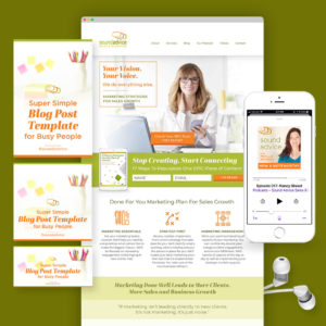
Next, we created marketing materials to support their day to day work including a PDF checklist available on their website as a lead magnet for both buyers and sellers.
Website Design
Finally, we moved to site design. Janet & Ray’s website came together with content and strategy by the amazing team at Scoop Studios. The site creates an approachable and confident first impression. Clear calls to action provide a seamless customer journey to help them attract their ideal client.
