Two Worlds Whiskey
Website Design & Development
Background
Two Worlds Whiskey had a big dream: to single-handedly create a market for luxury bourbon in France. Unfortunately, to the French, bourbon is seen as a liquor of last resort best mixed with Coke.
So our client’s challenge was essentially to reach across the Atlantic, take a bottom shelf drink, and skyrocket it to the bleeding edge of high-end liquor connoisseurs. No small feat.
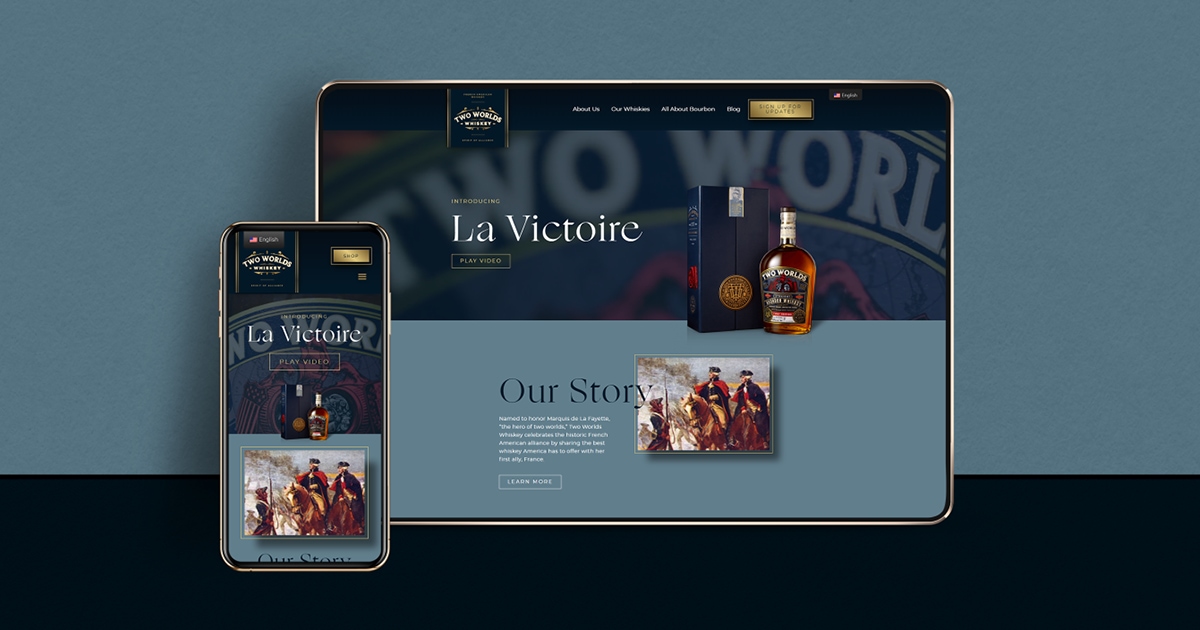
Ideas this big stay in the realm of dreams if they aren’t backed by clear vision. Luckily, Two Worlds had exactly that, so we dove into this challenge headfirst with them. The end result was an award winning website and a sophisticated vehicle to deliver the brand’s strategy.
Old World Aesthetic
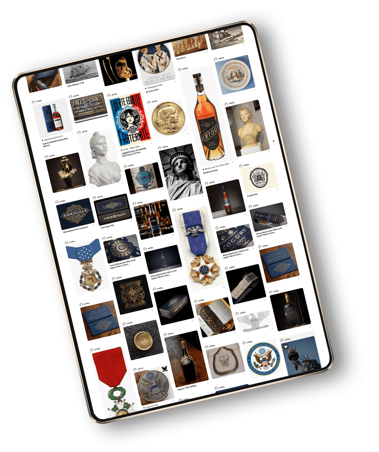
Our client came to us with an inspiration board full of images that evoked an old world military feel, along with stunning bottle and packaging designs by Chad Michael Studio. The brand shone through these elements, lending the feeling of walking into an exclusive club with deep-tufted leather chairs, nautical maps, mahogany walls, and a sense of camaraderie over shared unique tastes.
With such substantial and thoughtful design elements already in place, we had a great launching point for developing the website’s aesthetic.
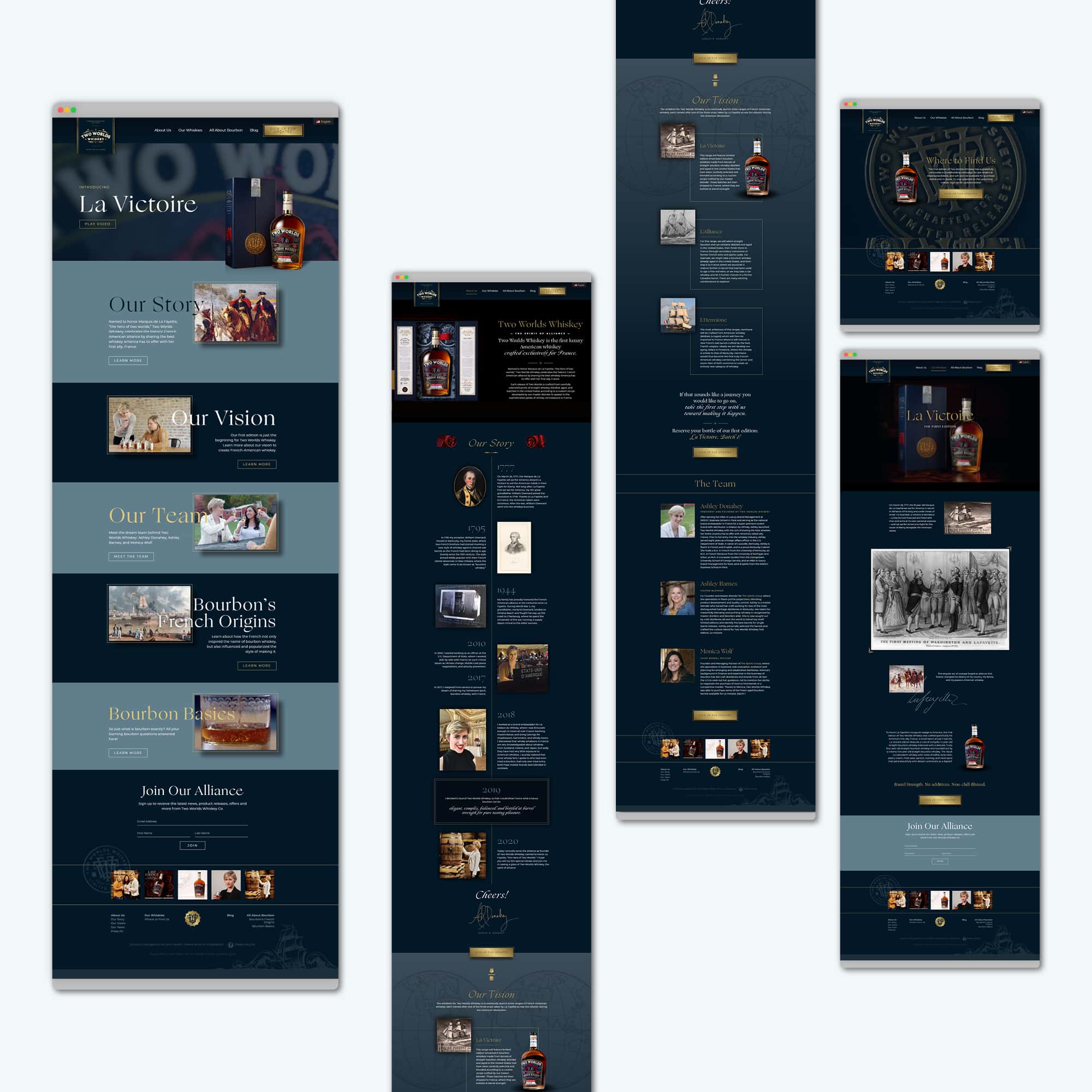
We pulled key elements from the bottle design – a ship, a seal, a map – to create a shared language between the existing packaging design and the website experience we were building. We used a deep, dark palette of blues to subtly call to mind the historical alliance between the French and the Americans and the seas that connected the two countries.
A Seafaring Font Palette Selected for Legibility and Style
The typography on the pre-existing packaging design was gorgeous as display type, but it wouldn’t read well for longer headings or paragraphs of text on the website. So we developed a palette of fonts that would speak the same language as the established branding while effectively organizing and delivering content on a screen.
The font we chose for headers and subheads, with its wispy serifs and dramatic swoops, pulls in the brand’s vintage seafaring vibe. Especially in areas where we used it in italicized form to add emphasis, you can almost hear the waves of the sea lapping against a ship’s sturdy wooden hull.
A modern sans serif font balances the subtle drama of the headers throughout the body copy. We used this same font in an bold uppercase style to provide a clear emphasis on call-to-action elements.
A Gorgeous Interactive Site
Two Worlds Whiskey’s goal was to change the French opinion of bourbon, so our site needed to really take visitors into the experience of a shared alliance. Our goal was to provide a small taste of the feeling you get standing by a tower of oak barrels on a Kentucky distillery tour while also imparting that sense of old world elegance associated with all things French.
B-roll video of the Two Worlds Whiskey facility’s actual bourbon barrels runs in the website header and instantly transports the visitor to a Bluegrass state of mind. Two Worlds packaging and website elements overlaid on top of the video lend an upscale polish.
Though we did build a shop, the site is organized so as to not just get a visitor to make a purchase, but to fall in love with bourbon and become a Two Worlds Whiskey fan for life. This part was key, as our client has a compelling vision for the future of the company and further exclusive runs of upscale bourbon batches.
To facilitate the relationship with the brand and its product, pages are dedicated to an in-depth history of bourbon and the insights of the company’s founders. To build on a sense of excitement for the brand and grow the customer base, email opt-ins appear frequently in key places of interest.
Throughout the site, elements emerge onscreen via fluid animations that capture visitors’ attention and encourage them to keep scrolling. Delightful hover effects on buttons and linked images add interest and incentive to continue interacting with the site.
Smooth Sailing
Instead of letting their French customers be at the mercy of the ever-capricious Google Translate, our client provided us with custom French translations for all of the website copy, ensuring a smooth experience for people on both sides of the pond.
Our site went on to win an award in the AIGA Louisville 100 Show. But most importantly, it was the vehicle for the very alliance Two Worlds envisioned, as they were able to build enough excitement to crowdfund their first run of French-targeted luxury bourbon. And judging by how the brand is catching on, it won’t be their last. Who says you shouldn’t dream big?

Working with Perennial Creative Co. was a breeze. Before, I felt overwhelmed by the amount of content that needed to be produced and choices to be made.
My greatest concern was whether it would be possible to capture the essence of the brand in website form. But Jessica's very structured approach to each step of the process takes the guesswork and overwhelm out of the equation.
She immediately understood my vision, and her execution of that vision really blew me out of the water. For those who fear handing over creative control of their brand, rest assured that you will be in very talented and capable hands with Perennial Creative Co.!

