Yen for Youth
Branding
Background
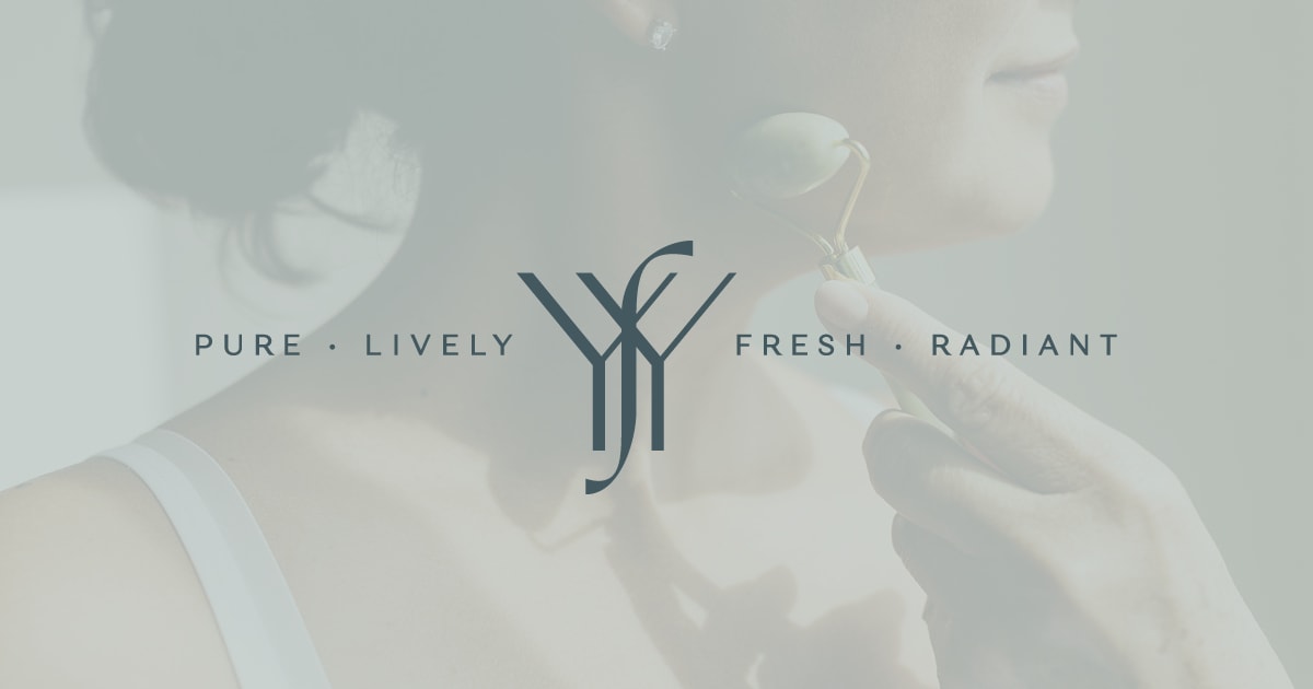
The refreshing branding design we created for Yen for Youth, a line of self-care products currently under development, gives you a taste of what it’s like to truly have it all.
Our client wanted to capitalize on the “clean girl” and “that girl” trends by cultivating a brand feel that is aspirational yet effortless, and fulfilling yet minimalist. This blend of on-trend aesthetics embodies living life to the fullest and being the most optimized version of yourself that you can be, with a spotless kitchen to boot.
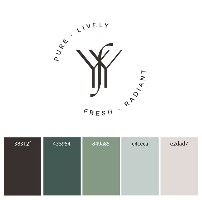
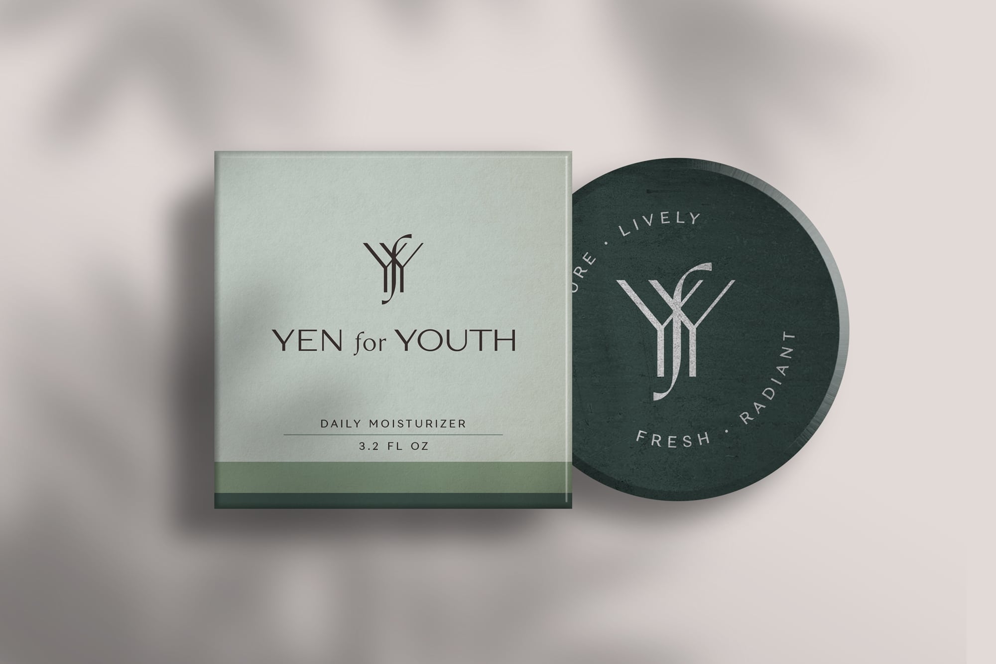
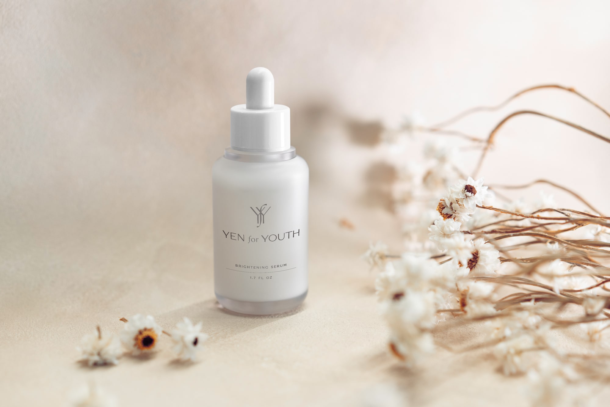
Clean, organic, minimal, and soul-centered branding was just the ticket, with a spate of sea-inspired greens, a perfectly balanced monogram, and a spare, easy sans-serif font. With a foundation like this, the possibilities for turning ordinary products into inspiring acts of branding are limitless.
