List With Libby
Branding
Background
Libby is an experienced real estate agent that had relied on a simply typeset logo since starting her business. As her business continued to grow and she sought to grow her team, she realized the need for a more recognizable brand that would instill confidence in her experience and knowledge.
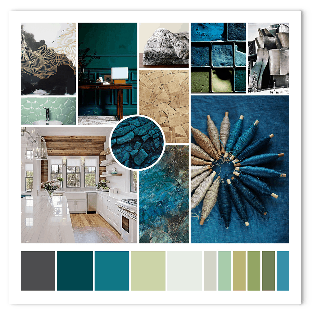
We worked together to create new branding that was feminine but not super girly. As we all know women lead the decisions in the home buying process, but the branding needs to not turn men away.
The moodboard reflects Libby’s clientele, educated foodie types who shop at boutiques and organic grocery stores and appreciate obscure things. Her clients are successful professionals who tend to shop in the hip and/or higher end parts of town.
Logo Design
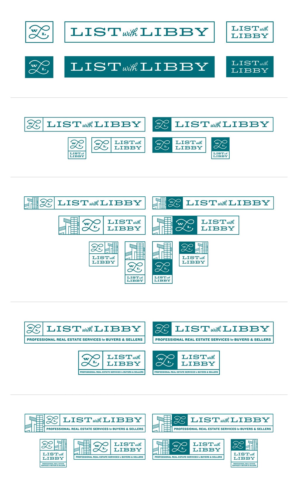
The main basis of her logo is a bold LWL monogram accompanied by a strong yet playful List with Libby wordmark projecting a confident and likeable air.
Then the logo evolves with the addition of a house icon and tagline, all joined together in an organized box fashion with boxes that can be reconfigured in a variety of ways to suit the need. This ensures that the logo is flexible across a variety of collateral and capable of communicating as much or as little as necessary.
As you can see, I had a lot of fun creating a variety of configurations with this system. I’ve organized them here by what’s added to the monogram + wordmark, house, tagline, and house + tagline.
Providing both the light and dark monogram makes it even more useful in all the diverse situations Libby might encounter as well as allowing it to really stand out or just be more of accent piece as it is on the guide covers below where the contact info and photos are also important.
Collateral
The monogram itself is a great subtle branding element for client gifts while the larger configuration creates an informative lockup on the cover of Libby’s welcome guide. We even fit Libby’s photo into the simpler mockup on the front of her business cards.
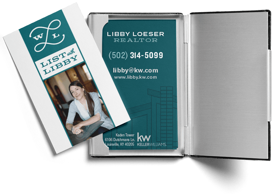
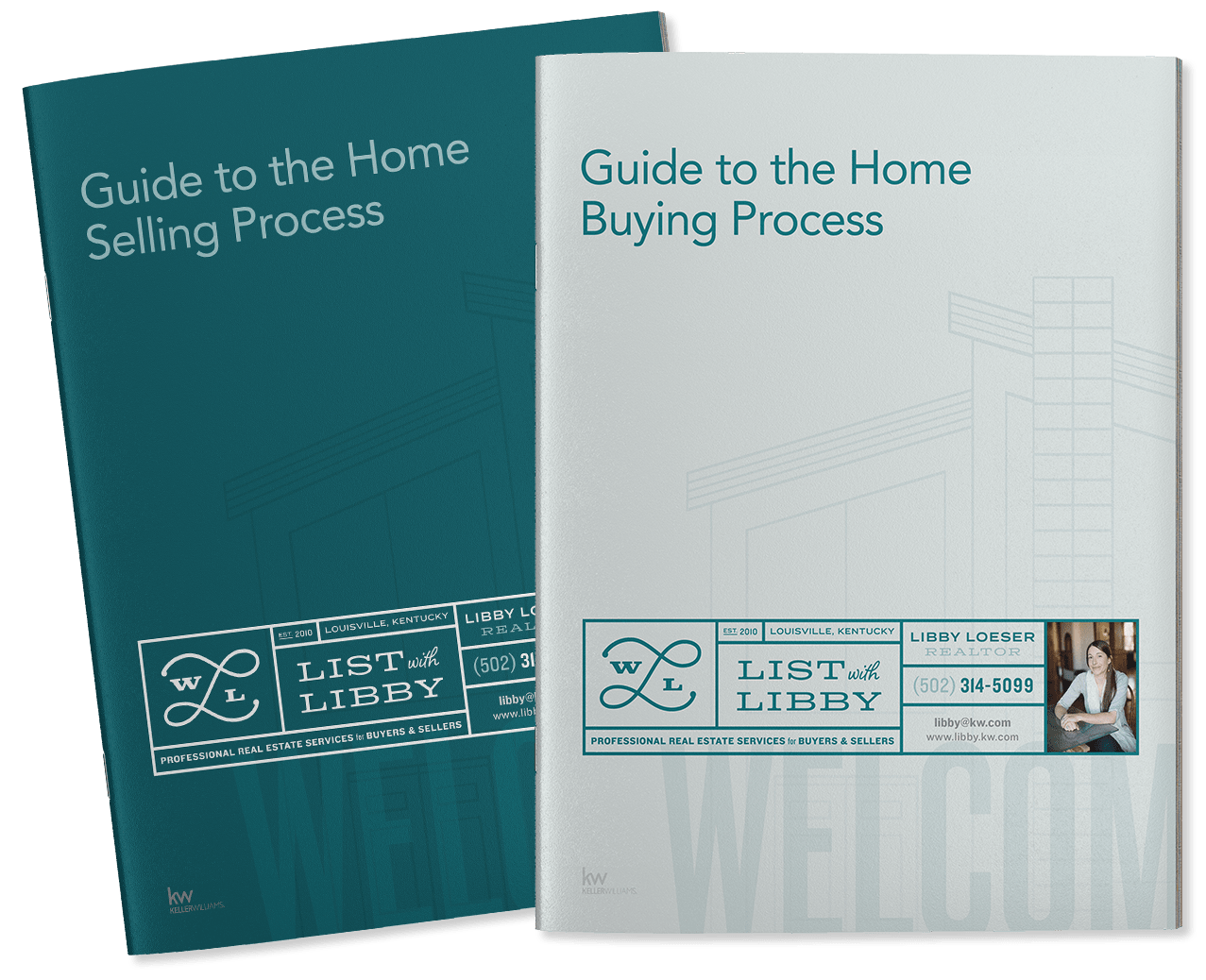
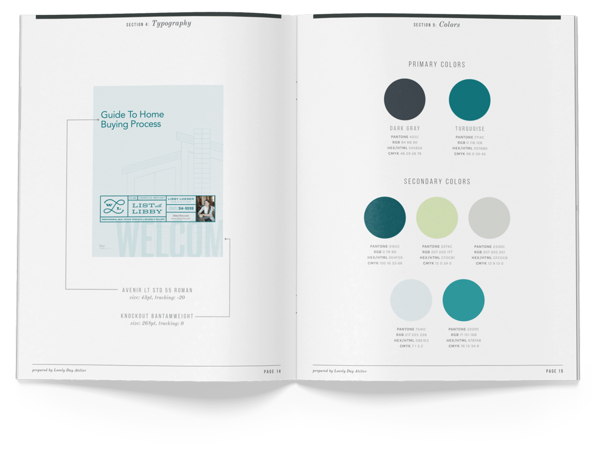
The house illustration and large graphic text are used as accents on the collateral items to continue the cool, trendy vibe.

Jessica delivered a logo + branding that are a perfect fit for me and my business and speaks to my ideal clients.
Jessica’s process was creative and fun and she really listened to what I envisioned. When you work with Jessica, you’ll receive excellent design services from a designer with an experienced, creative eye that truly understands the power of branding.

