Horizon Peak Consulting
Branding
Background
Horizon Peak Consulting is a fresh, strong, and confident content marketing company that needed visual branding to match their high caliber of services. They wanted branding that would convey their depth of expertise and how easy it is to work with them, empowering and assuring their ideal clients to choose them over their competitors.
Moodboard
The tone we sought was one of warm competence: a mountains-meets-technology feeling that’s grounded but tech savvy. Our moodboard gave these concepts life, creating a calming and confidence-inspiring visual experience.
Well-constructed, approachable sans serif fonts convey friendliness and precision.
Deftly applied linear patterning lends a modern tech aesthetic.
Textural photos of mountains in simple monotone or silhouette create subtle calls to the solidity and abiding power of mountains without drawing the focus too much towards nature.
Deep blues, refreshing aquas, and pops of persimmon create a color story that soothes, builds a sense of ease, and powerfully emphasizes where needed.


Logo Design
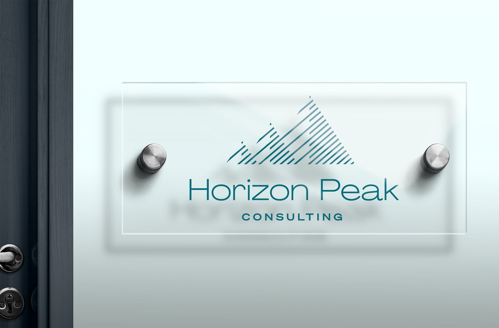
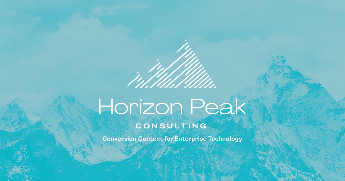
The logo we developed takes the experience of the moodboard and distills it down to a potent insignia of the Horizon Peak brand and its ethos.
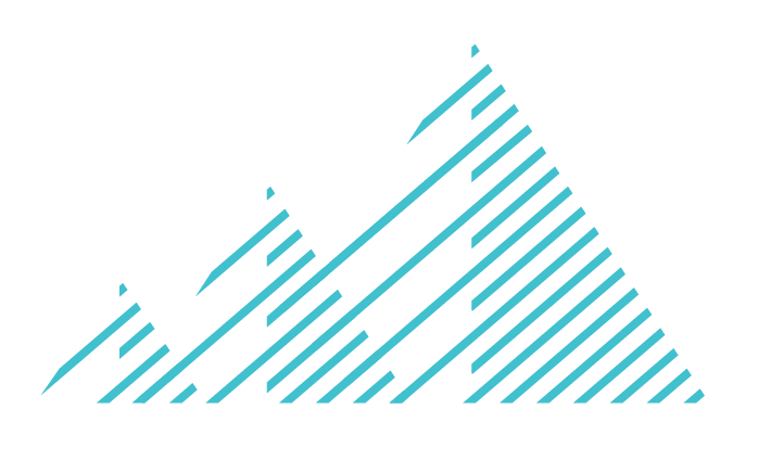
A pattern of parallel lines in the shape of mountain peaks resembles upward trend lines on a graph, creating a perfect harmony of groundedness and tech.
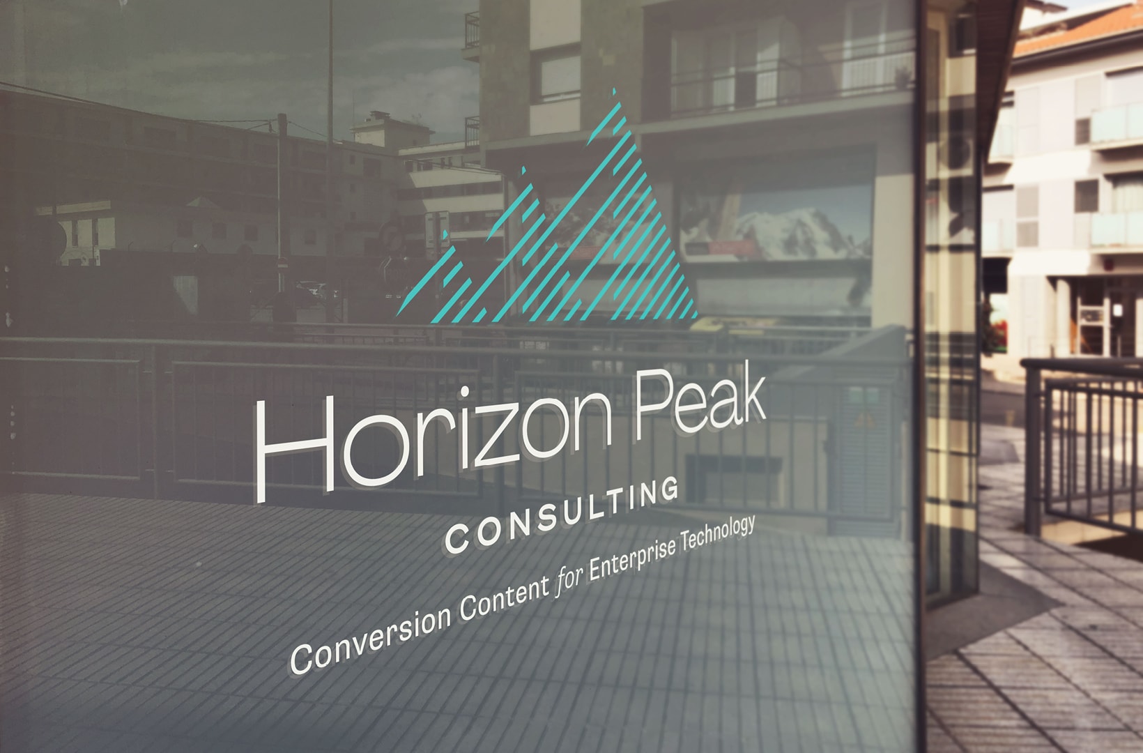
The brand name and tagline use a sans serif font that feels built and substantial yet effortless and light.
Logo variations all stick to a simple color scheme that echo a modern, human professionalism, with either deep teal or fresh turquoise contrasting with clean white. The different configurations of the logo that we delivered ensure that the brand will shine across any platform or context.
