Yoga for You
Branding
Background
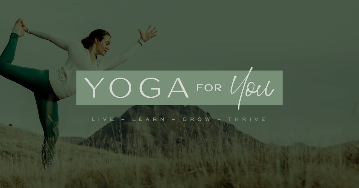
Yoga for You provides location-independent yoga and mindfulness services that help women connect with their deepest selves.
When YFY approached us, they had already built a remarkable following despite the fact that they’d never established a logo or consistent brand identity. This spoke volumes about their impact–and their potential. Since the brand was flourishing and growing, it was long past time for it to have a visual language all its own and thrive on new levels.
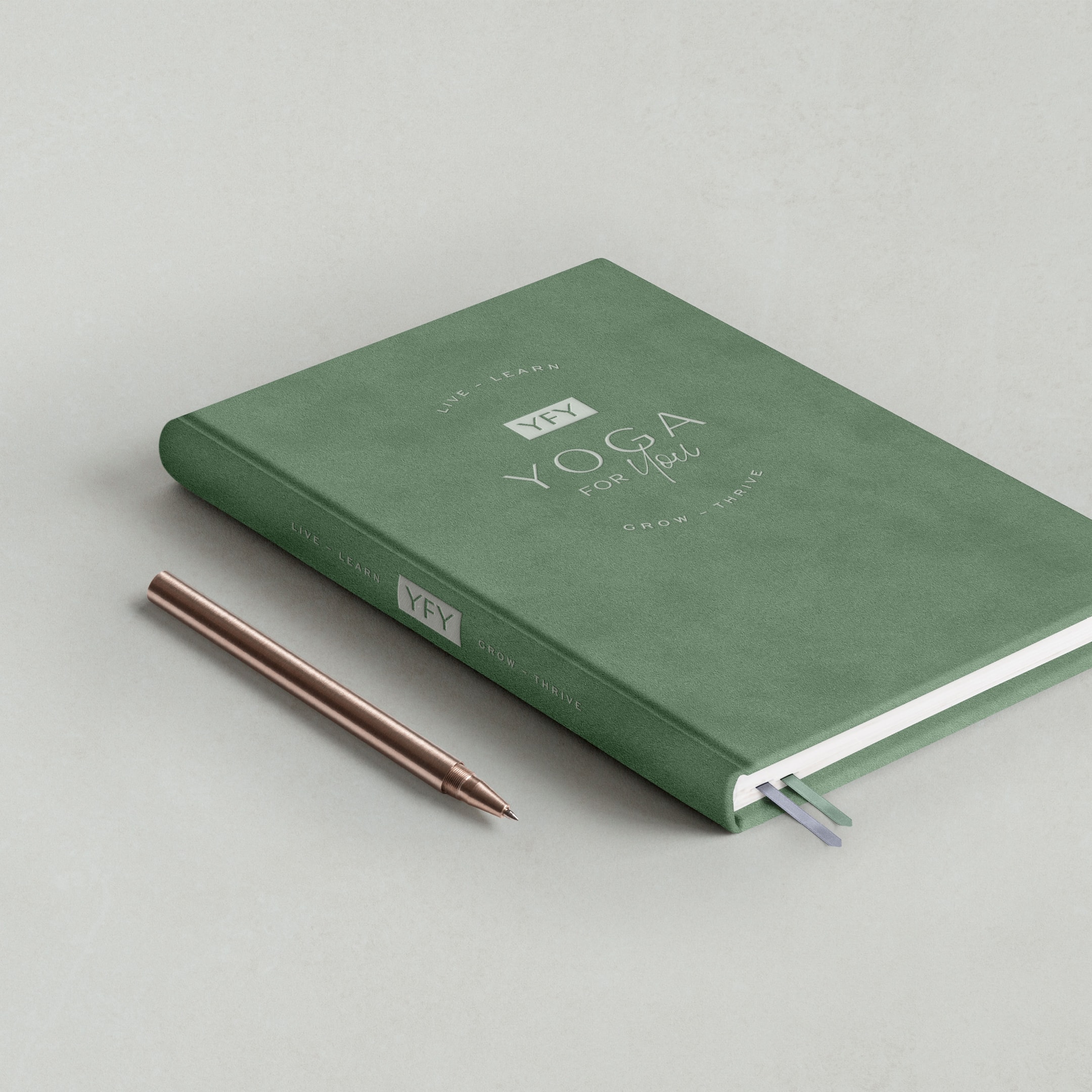
We crafted a versatile branding package that empowers YFY to infuse a branded touch to anything they can dream up, and leave their mark on the world while they’re at it.
Moodboard
Our aim was to create a warm visual brand experience that welcomes, inspires, and excites women to engage with Yoga for You. To this end, this project’s moodboard combines clean and classic elements with an earthy, feminine touch.
The color story of the moodboard is told through natural and soft hues, with a gentle green setting the tone. A grounding, soothing, and calming effect is evoked through the use of natural textures like stone and wood.
Fonts trend towards sans serif, with subtle contrasts in stroke weights that lend a friendly, slightly softened appearance. Pops of lightweight handwriting script provide emphasis.
Layouts are characterized by their cleanliness and a simplicity that borders on minimalism. Pristine blocks of white juxtaposed with solid blocks of color or texture resonate with the fresh, cleansing feel of the brand.
Logo Design
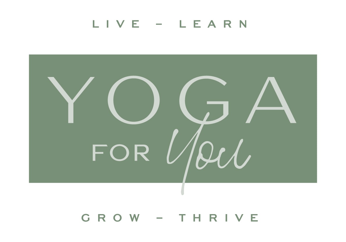
The logo package we developed for Yoga for You is as flexible as any seasoned yoga practitioner.
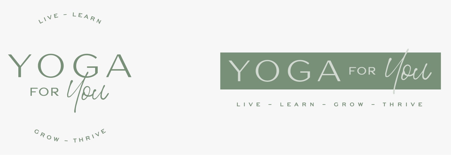
The primary logo carries over the moodboard’s earthy palette and compelling minimalism, showcasing a clean, modern sans serif font in all caps. The font’s subtle contrasting line weights establish a warm and connected feel. A script font calls forth the “You” text from the brand name, adding to the vibe of personal connection.
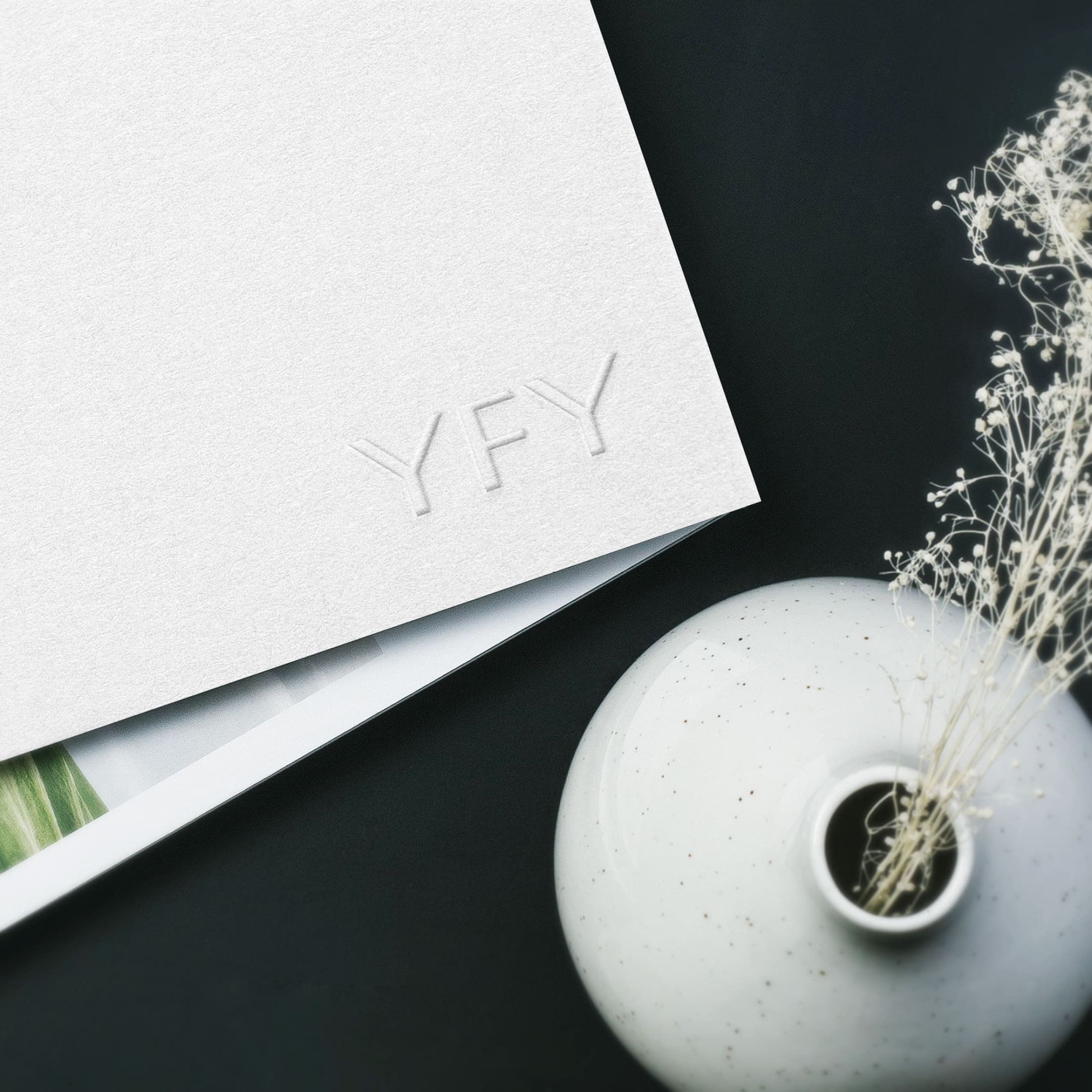
The YFY monogram mark is built with wide, grounded characters that feel anchored and present. The top stroke of the "F" is cut away to nestle into the last "Y," creating a pleasingly even mark that calls to mind the brand’s focus on bringing balance to people's lives.
This primary logo can be used with or without the monogram mark and tagline to lend it versatility across a wide variety of contexts. It also makes up the core of a larger master logo that is designed to be used in situations where YFY wants to make a big, bold, and highly branded impression.

Font Palette
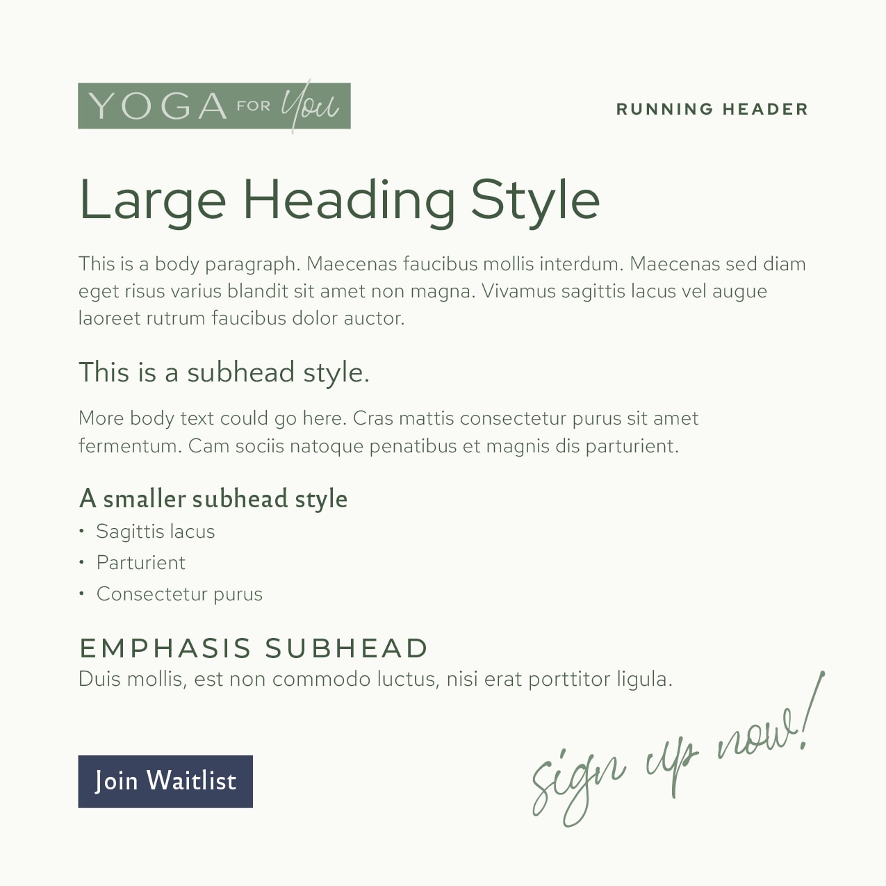
As a successful and evolving brand, Yoga for You’s branding needed a dynamic type package that would harmoniously enhance visual clarity and provide pops of interest to the written word.
The font palette we curated complements the connected and contented character of the brand. A hierarchy of header fonts builds a typographic scaffolding that adds legibility and ease to textual content, all while telling the same typographical story as the logo. The casual organic script from the logo’s “You” lends emphasis to copy wherever it’s called for.
