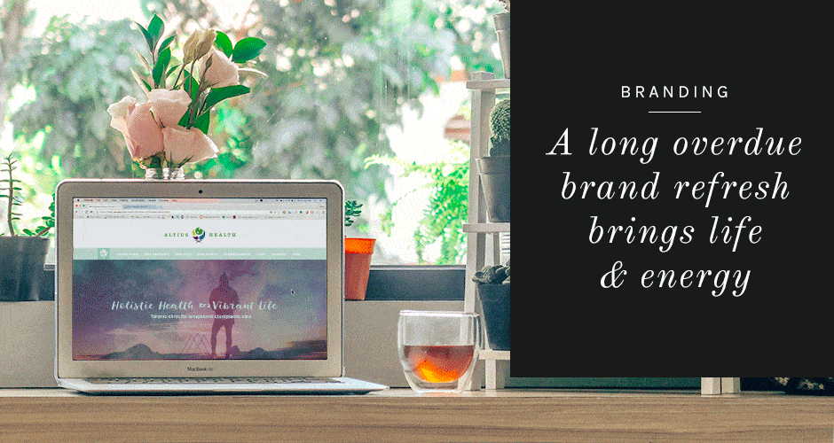
Altius Health: Brand Refresh + Web Design + Collateral
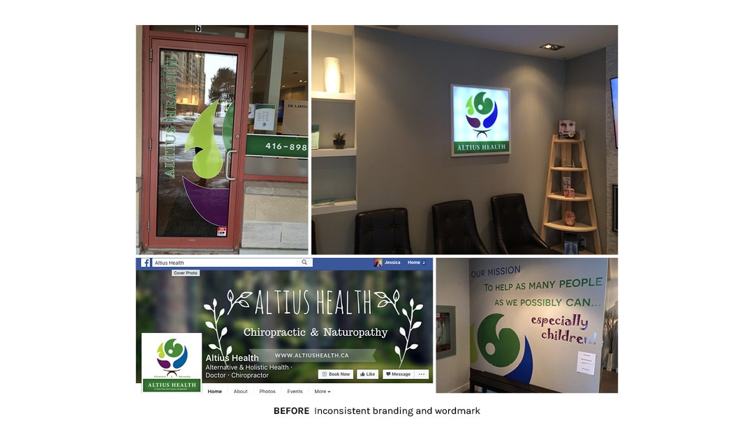
Early Branding Done on an As-Needed Basis
Altius Health started out with unique logo and color scheme that established a strong brand identity for the company. But since the logo was designed before the company even had a name, there was no set wordmark and the icon needed to be refined. On top of that the color palette, while unique and effective in the market, did not translate well to additional materials. And last, the template website did not serve the business well.
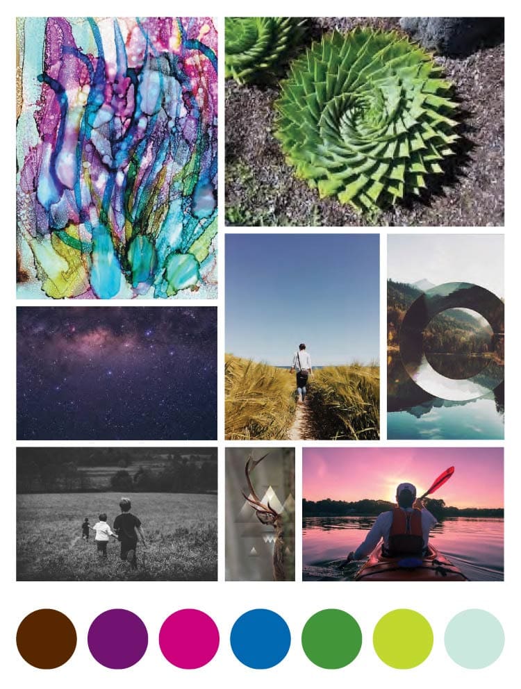
Moodboard Sets the Tone
So first, I created a moodboard with a distinct image style and additional colors to expand the brand. Building on the client’s audience of people who are very health conscious and drawn to more natural forms of healthcare we chose photos that had an energetic and authentic feel.
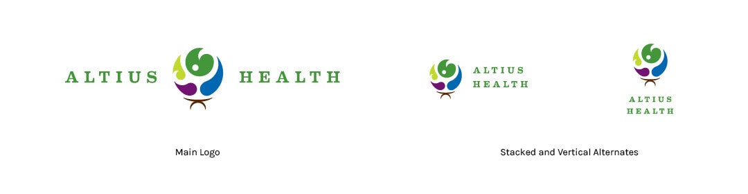
Icon Refined + Wordmark Defined
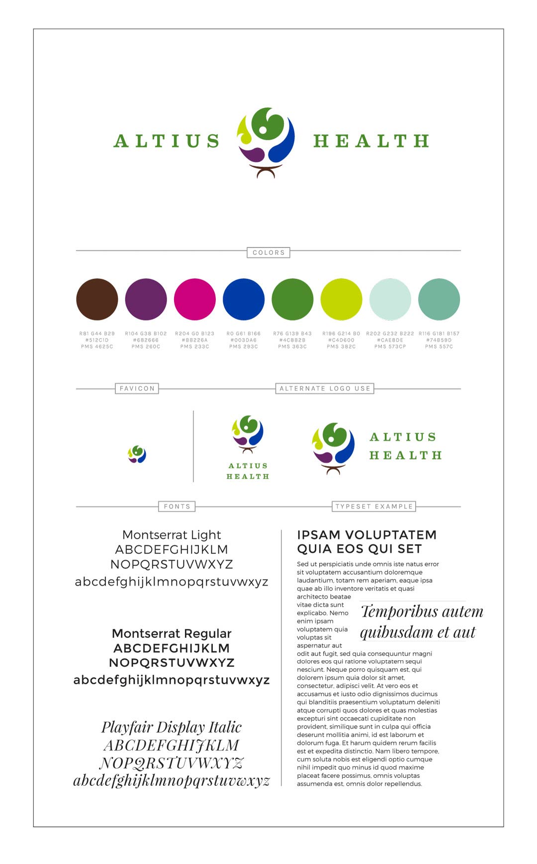
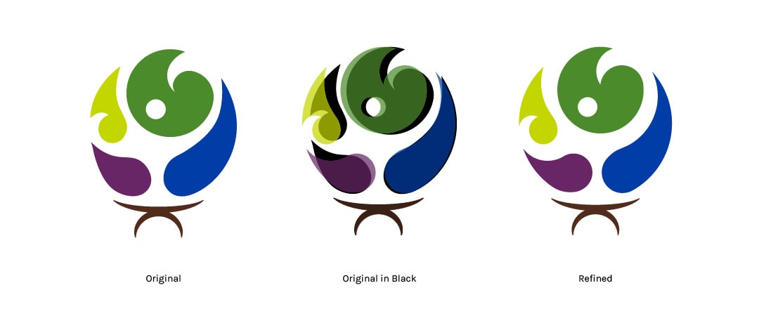
Next, I refined the icon – making the shape fully round and smoothing out some lumps and bumps. We tried some alternatives to this icon – some with just 3 shapes, some rotating the existing, but decided we liked the balanced and uplifting feel of the original orientation and shape placement the most.
Following that, we tested some new options for a wordmark that could be used consistently alongside the icon. This wordmark was created in multiple orientations for use on various platforms. We went with a serif font set in all caps similar to the formats that were in use as we liked the air of authority that it lent as opposed to a script and humanist font that we tested that felt very fun and friendly. This new serif feels friendly and comforting while maintaining that air of authority and professionalism.
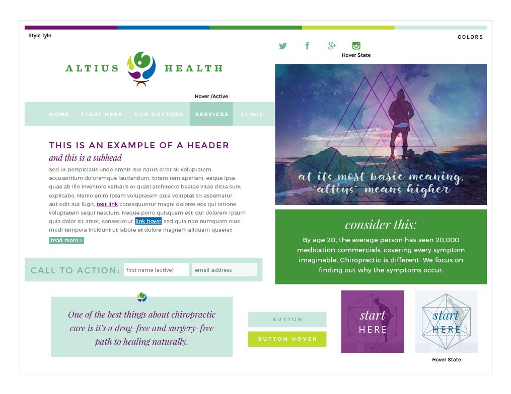
Website Design Begins with the Style
Next I created a style tile that would dictate the design elements of the website before we moved into final design. Working through the process of creating a style tile with clients helps to eliminate surprise once we get to the full site design. As you’ll see there are some slight differences, but overall the feel is very similar. We utilized sacred geometry and overlaid night sky photos to provide a feeling of centeredness and connectedness to the natural world to relate to Altius’ clientele’s desire to lead a more holistic lifestyle.
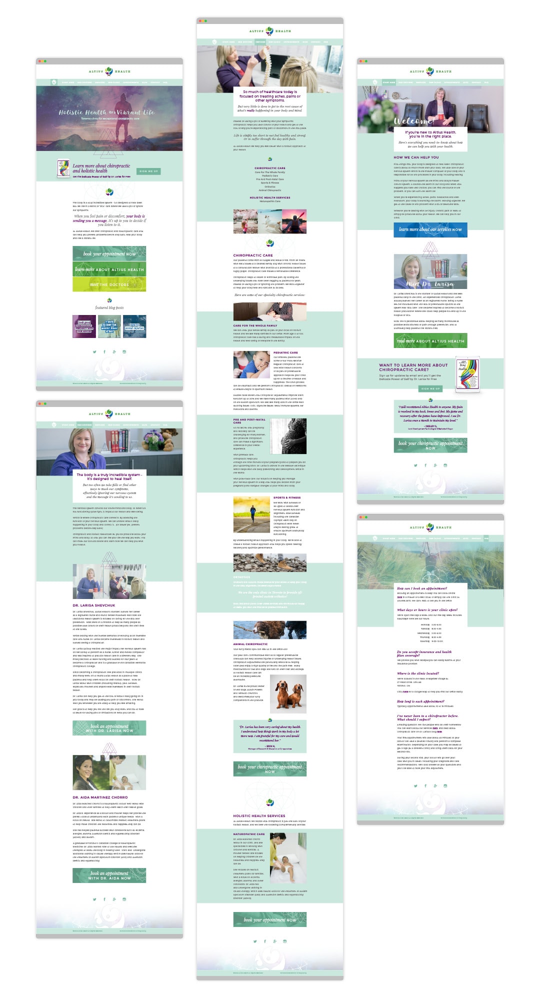
We moved into full site design and created a beautiful site that perfectly captures the Altius Health brand vibe.
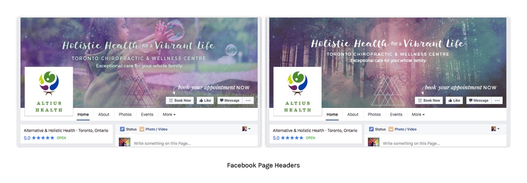
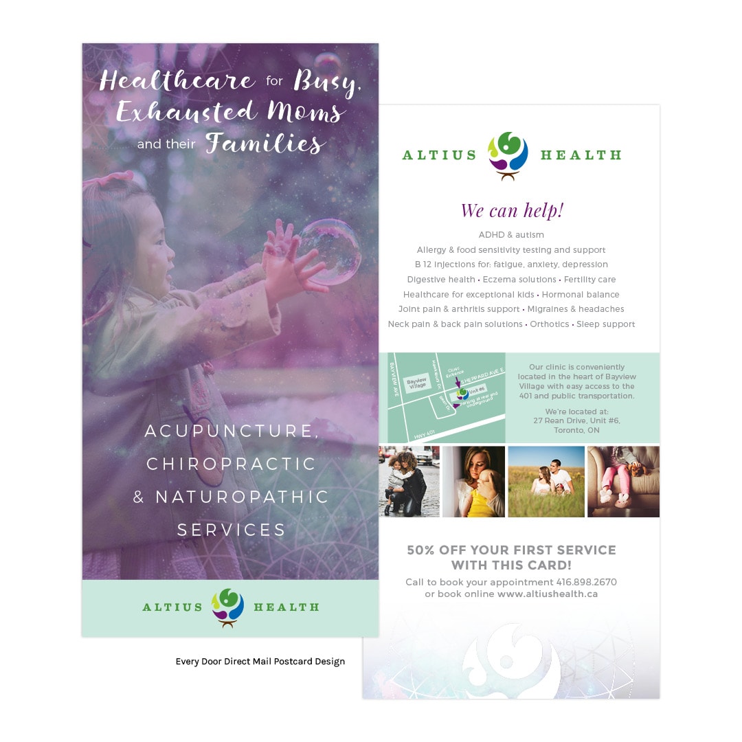
Collateral Rounds Out the Brand
Last, we created social media graphics and an every-door-direct-mail piece to create a consistent look across all touchpoints.
The final brand board pulls together all the colors, logos, fonts, and favicon for the client’s use in the future.