Skip to content
PC-Logo-Gold-no-stroke
  • About
  • Services
  • Portfolio
  • Blog
  • Contact

Logo

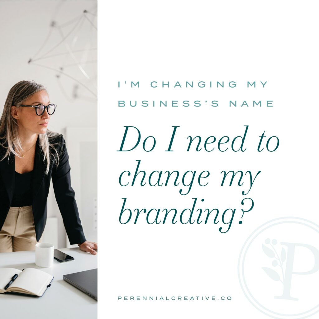
I’m changing my business’s name! Do I need to change my branding?

By Jessica Suhr | February 13, 2024

Maybe you started out calling your business by your own actual name, but it’s grown beyond just you. Maybe you’re changing the nature of the very work that you do and need your company name to reflect that. Or maybe you’re preparing your business to be sold later on down the road and need to…

Read More
More pets, more flowers, over on Instagram

Think a logo is all you need? 🤔 Think again. I Think a logo is all you need? 🤔 Think again. I can’t tell you how many times I’ve heard, “I just need a logo,” from potential clients.

Yes, your logo is important, but your brand’s visual identity goes beyond just that one graphic—it’s about creating a cohesive, recognizable presence across every touchpoint. 🎨✨

Swipe through to see why your business’s full visual brand matters and how it impacts trust, credibility, memorability, AND your bottom line. 

Then, go check out the full post for a deeper dive. 

**And I want you to know, even if you’re not ready to pay a designer for a full visual brand, you can start taking steps to be more consistent with your brand even on your own. There are some tips in the post.**
The icon in the Page & Podium logo is more than ju The icon in the Page & Podium logo is more than just a pretty, uplifting mark—it’s a story in visual form. When designing the logo for Page & Podium, we wanted to create something that felt strong, structured, and connected to the brand’s mission of helping mission-driven professionals establish their personal platform.

📖 The Open Book Symbol – At the heart of the design is an open book, representing the power of written content and thought leadership. Page & Podium empowers experts to share their knowledge, and this shape reflects the foundation of their work in the written word—turning expertise into impact.

🎤 A Platform for Stories – The microphone reference symbolizes authority and expertise. Just like a speaker stands on a stage to be heard, Page & Podium helps professionals amplify their voices and position themselves as leaders in their fields.

The book fan icon extends beyond the logo as well and can be used as a branded accent to add balance and flair to content (check it out on the website) and combined with Page & Podium’s taglines to create an impactful messaging element (see the super cute tote).

When you have a unique, meaningful, and versatile mark like this, owning your brand is FUN and empowering.
🔥 Good times. Bad girls. 🔥 I know I’ve te 🔥 Good times. Bad girls. 🔥

I know I’ve teased a little bit of our work with Stripcraft and @lux_atl , and now I’m finally ready to share it starting with the super fun branding we did with gobs of different logo configurations and branding marks. It was seriously so fun to work on. 

Stripcraft isn’t just a brand—it’s a movement. A place where everyday women trade business suits for rhinestones, and step into a world that’s equal parts playful, powerful, and provocative.

When Stripcraft came to us, they already had the spirit—but they needed the polish. Their brand wasn’t quite refined enough to match the high-end retreats and experiences they were offering. So we got to work. 💃

The new Stripcraft brand feels like a secret bad girls’ club, with a visual identity that’s as daring as the women who embrace it. We designed a sleek, electrifying brand experience that turns up the heat without losing the edge:

✨ A logo suite that screams forbidden allure—gothic blackletter meets neon-inspired script, complete with a dancer’s silhouette and iconic ray motifs.
 ✨ A rich, moody color palette—deep purples, fuchsias, and teals glowing against a near-black background.
 ✨ Typography that teases—witchy, scripted headlines with sultry ligatures and bold contrast.
 ✨ Photography direction that seduces—lingerie-clad close-ups, club-inspired lighting, and a visual story that invites women to step into their fantasy.
 ✨ A website that performs—not just functional, but sensational, with bold animations, custom icons, and a layout that keeps visitors hooked.

And because Stripcraft is more than just one experience, we crafted sub-brands for every side of their empire—from high-end retreats like StripCabana to the School of Stripcraft’s year-long dance journey.

This isn’t just branding. It’s a visual revolution for women who are ready to own their sexy, confident selves. And we are so here for it. 😈

💜 Step into the world of Stripcraft the link is in our bio!

More to come on the website and other elements!
This super friendly and fun font family is Neulis This super friendly and fun font family is Neulis Neue by Adam Ladd @adam.ladd.design. We selected Neulis Neue for the bmpconsulting website as its fun feeling perfectly captures Bethany’s vibrant personality and her ice-cream-themed brand and website. 🍧 🍦 🍨 

Now let’s get into some font geek talk:
✵ The Neulis font family is a cheeky mash-up of a strict geometric sans serif and jovial upright script font. I love an upright script with the friendly tails on the letters. 
✵ The monoline or uniform font stroke feels warm and balanced. 
✵ The large x-height (that’s how tall the lowercase letters like x and e are) makes this font super legible and approachable feeling. 
✵ And with a huge range of font weights, this font is super dynamic and versatile in use.

These are all qualities you’d want in your grant-writing professional, right? Balanced, friendly, warm, approachable, and fun—just like Bethany! Grant writing might be tough, but Bethany is a ray of sunshine to her clients and colleagues. That’s why this font is the perfect match for bmp + Bethany.

Swipe to see Neulis Neue in use in the bmp consulting website and collateral. 

Feel like your brand needs a font palette that speaks directly to your values? 👋Reach out and let’s explore how a tailored font selection can amplify and clarify your brand’s voice.
🌿✨ Nothing can bloom forever. As we embrace t 🌿✨ Nothing can bloom forever. As we embrace the equinox and the days continue to shorten here in the northern hemisphere, nature's flora and fauna are reminding us of the beauty in cycles and the importance of rest.

Do the shorter days and longer nights make you feel sleepier or more energized?

For some, it’s a time for cozy hygge, warm blankets, and longer sleeps. For others, it’s a chance to dig deep and focus, free from summer distractions.

I hope you find the best of both worlds as the nights grow longer over the next three months. 🍂💛 #Equinox #NatureCycles #CozyVibes #FallFeels
We're thrilled to unveil the work we did for Page We're thrilled to unveil the work we did for Page & Podium (@pageandpodiumpress), a transformative initiative that uplifts community leaders by helping them publish impactful, message-centered books.

Our mission? To craft an intentional visual brand experience that embodies approachable expertise in the ghostwriting and publishing industry.

The result? A clean, elevated, and friendly branding that speaks volumes.

The Page & Podium brand is a blend of:
✨
Inspirational Elements: Cultivating confidence, authenticity, and an uplifting aesthetic.
✨
Impactful Typography: Tidy serifs paired with hand lettering accents for warmth.
✨
Clean Layouts: Bold color blocks, subtle gold accents, and rich textures.
✨
Sophisticated Palette: Deep hues for power, tone-on-tone values for sophistication, and pops of salmon and teal for highlights.

Check out the full case study on our site to see more on how we brought this vision to life. Intentional design elevates brands!

Perennial-Creative-Monogram
Brand Design & Cultivation

Branding & Websites

In-House Design

Special Projects

About

Portfolio

Blog

Contact

Resources

Home

Join our email list and we’ll send new projects and articles straight to your inbox.

Thank you for subscribing!

© 2013-2025 Perennial Creative Co., LLC | All Rights Reserved.
Privacy Policy | Terms & Conditions

social buttons pinterest
social buttons instagram
social buttons facebook
social buttons contact

Designing from Louisville, KY and serving clients world-wide.
Branding, Design & Development by Perennial Creative Co.

social buttons pinterest
social buttons instagram
social buttons facebook
social buttons contact

Designing from Louisville, KY and serving clients world-wide.
Brand + Website Design & Development by Perennial Creative Co.

© 2013-2025 Perennial Creative Co., LLC | All Rights Reserved.
Privacy Policy | Terms & Conditions