The Proof is in the Pudding… or the comment box.
I was the lucky benefactor of some vandalism at the architecture firm where I used to work. For some reason unbeknownst to anyone, persons unknown threw a rock at one of the lower level windows of the office which just so happened to be a window with an enormous and outdated graphic on it. So, I was finally able to come up with something to replace what had been there.
For three years running, our company had been selected as one of the Best Places to Work in Kentucky. The rankings were based on a number of factors, one of which includes an employee survey. On that survey they asked tons of questions about what it’s like to work at the company and people had the chance to offer candid feedback. After all the surveys had been turned in and tabulated, we got to see the surveys and all those comments that employees had made. And it was actually all pretty good feedback.
Brainstorming
In a brainstorming meeting with our CEO and our Talent Scout, we came up with the idea to actually feature that feedback as our new window graphic. It seemed a lot more genuine than just slapping the big award logo up there and calling it a day. We wanted to actually show people why we had received that award for three years in a row.
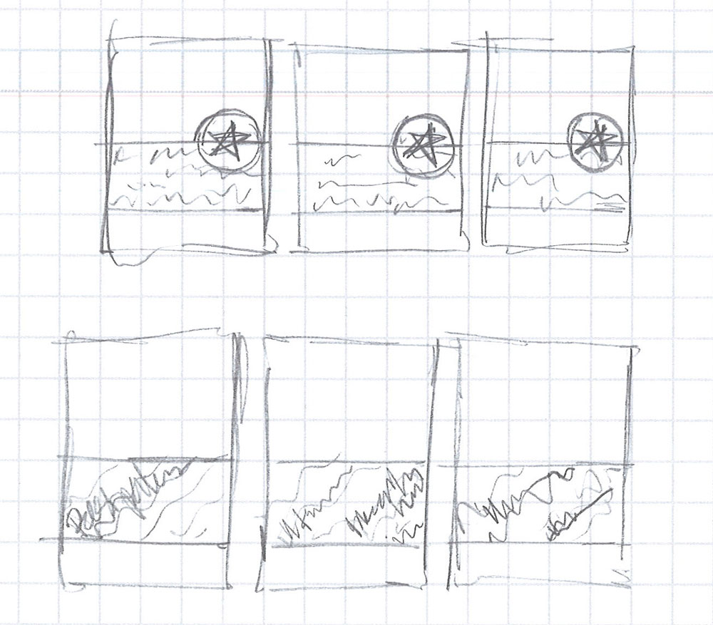
So, I did some sketches:
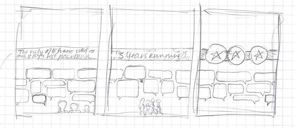
Color Options
We (marketing department, CEO, etc.) all loved the look of it but went back and forth for a while on the color scheme. Here were some of our favorite options:
Click on these thumbnails to view the whole image.
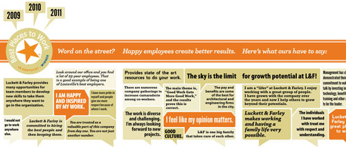
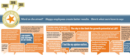
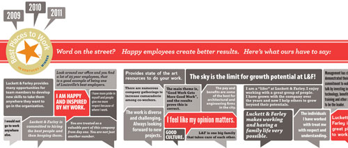
We ended up going with the beige and orange, but my favorite was the orange and blue.
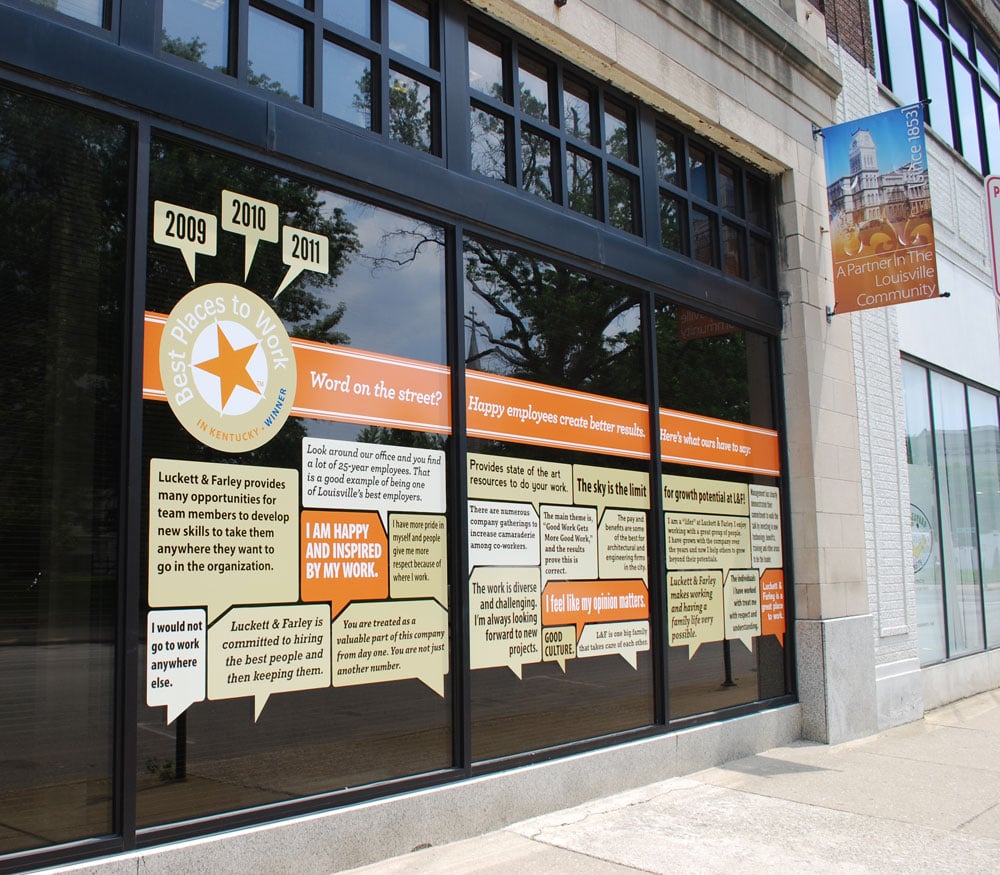
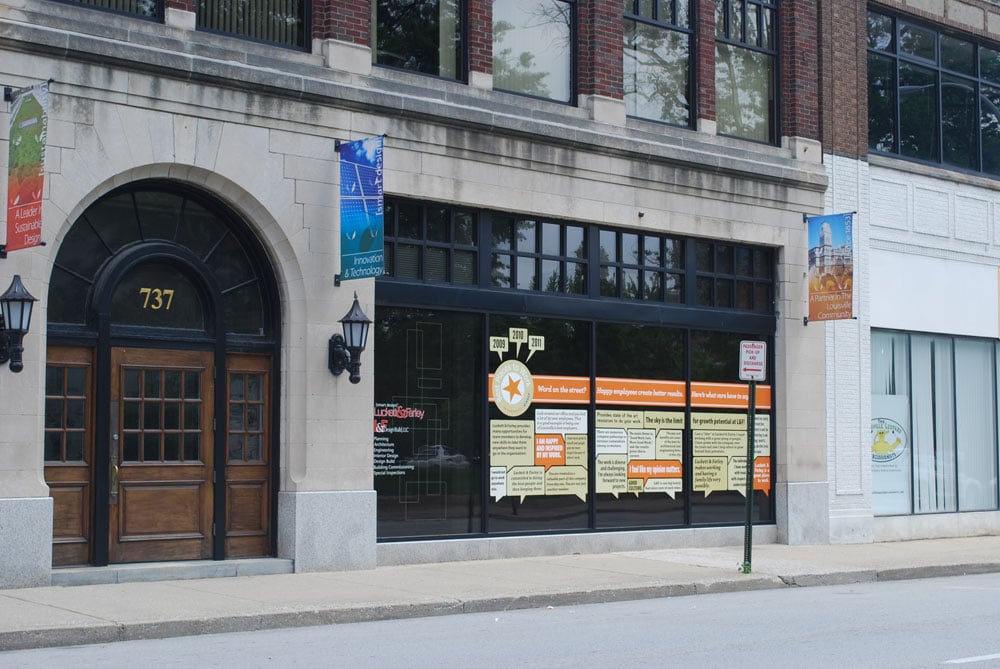
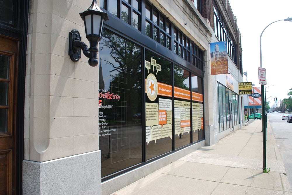
And here’s what the final product looked like:
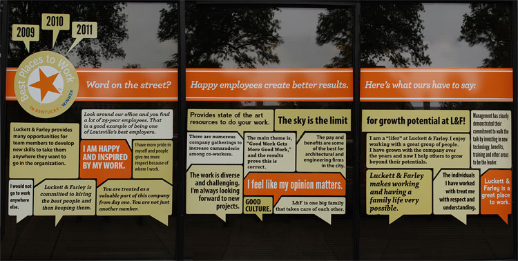
I’m pretty happy with how it turned out. While it was not as effective for fast moving traffic as our giant graphic before was, it was effective for new recruits and clients coming to the office. Traffic would frequently back up our block so it gave bored drivers a little something more to look at.
Click on these thumbnails to view the images larger.

We took the speech bubble concept and applied it across all of our recruiting materials and advertisements as a way to showcase how our actual employees felt about working there.
Keep reading, friend!